
A very common problem for artists trying to create realistic wood materials is having to find a good texture that is of the exact same grain and color as the one you are looking for in a reference.
Sometimes you go to Google and get your hands on a texture that looks great, the grain is perfect, but the color is a little bit off. Maybe it’s a little too dark or a little too bright.
If this is the case, don’t worry, in this short tutorial you’ll learn all you need to know to modify the color of any texture to adapt them to your needs.
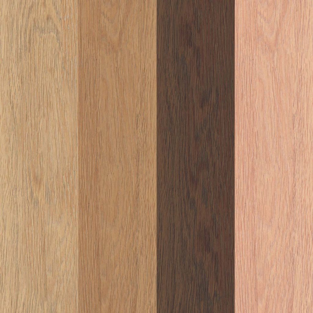
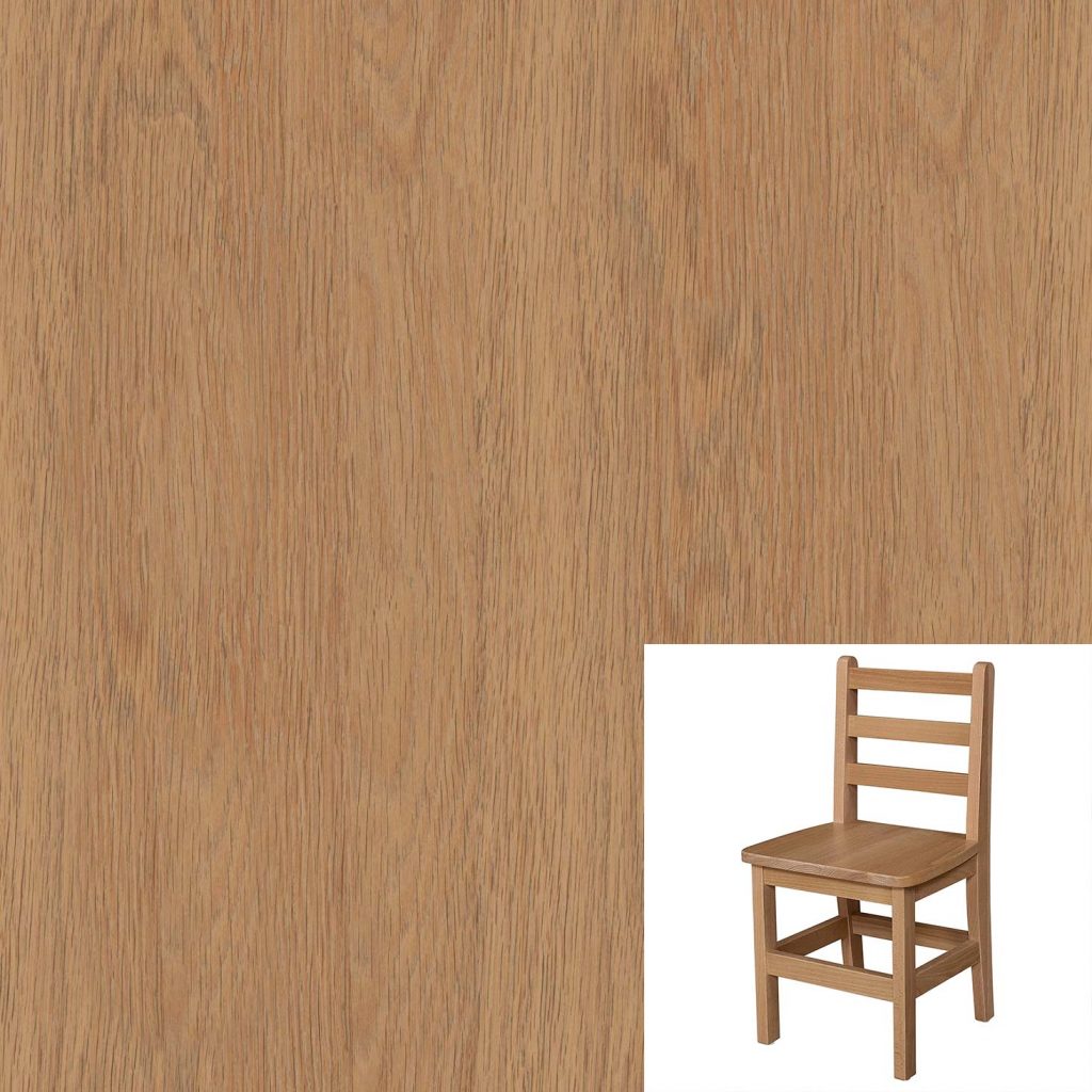
For this example we’ll use this one:
Ok, so the first thing to do is to open Photoshop and load the texture.
You’ll have to create two layers, one for the texture you’ll be working with, and, on top of that, another one with the reference image you’ll be getting your colors from.
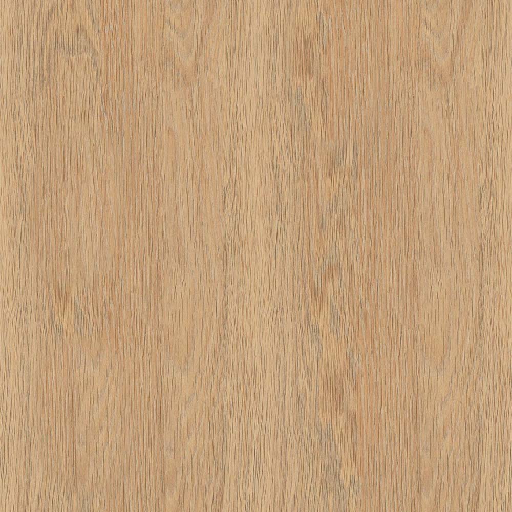
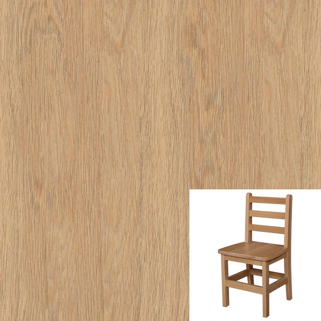
Here is the first example we’ll be working with. You can choose whichever reference image you want, this was just downloaded with a quick Google search for “wooden chair”.
Let’s get to it then.
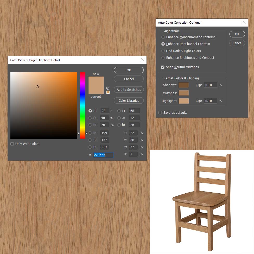
The first thing you’ll need to do is create a “Curves” adjustment layer on top of your working texture.
Make sure that Layer thumbnail is selected (and not the mask) and go to the Properties menu on the top right corner and click on “Auto Options”.
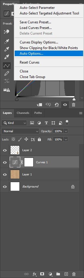
In the Algorithms section, select the one that says “Enhance Per Channel Contrast” and put a tick on “Snap Neutral Midtones”.
Then, you’ll need to grab three different colors from your reference image, one for the Shadows, one for the Midtones and one for the Highlights.
Be careful to pick up colors from an area that’s not too dark or too bright.
And there you go!
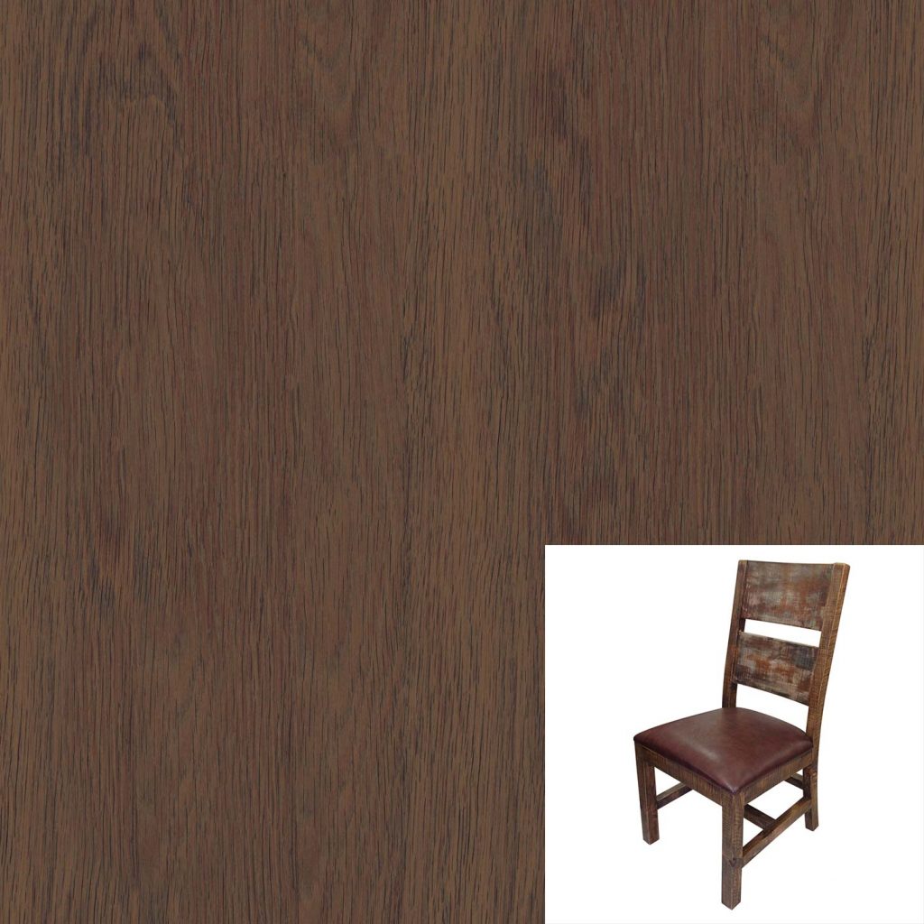
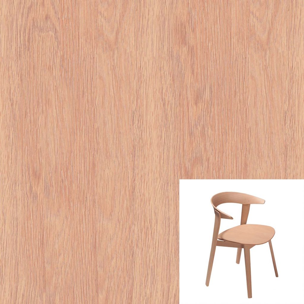
Let’s try with a couple more chairs.
Here’s a darker one.
And another one, a little more redish.
So that’s it! A super easy way to modify and create your own wood textures from a reference.
Hope this tutorial was helpful, and if you liked it, please share it!
See ya in the next one!